HONG KONG TYPOGRAPHIC
‘HONG KONG TYPOGRAPHIC’
Scroll down for ‘The story behind the print’
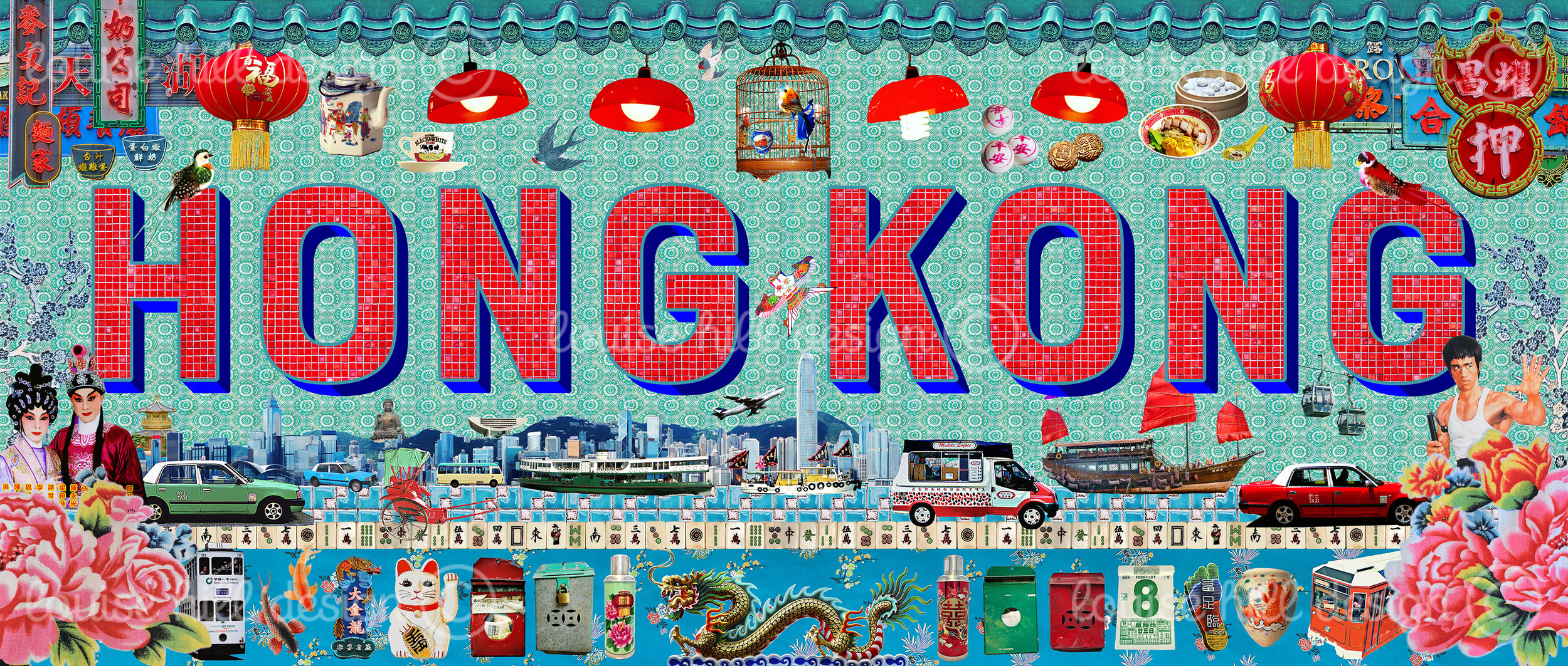
As a graphic designer I love to work with typography, so for this Hong Kong design I thought it would be fun to create a colourful lasting memory of Hong Kong using type combined with images. The images are photographs of vintage objects I have collected or buildings on the street that relate to a ‘nostalgic’ look at Hong Kong’s heritage. I lived in the ‘laid back’ old fishing village of Sai Kung in the New Territories for many years but also loved the vibrant buzz and grittiness of the city and Hong Kong Island, so full of life and adventures to be had!
I have used many images that reference Hong Kong’s ‘daily life’ to create this artwork, for example the red tiles inside of the type is a photo taken inside an MTR train station and the blue tile pattern which represents the sea is a photo I took inside a rarely seen old ‘village house’ on a trip from Sai Kung to one of the outlying islands. I have added images of recognisable landmarks and iconic symbols of HK including the taxis and trams, the famous Aqua Luna Junk, letterboxes and various ‘good fortune’ symbols such as the ‘Lucky number 8’, Lucky Cat and my favourite ‘Double Happiness’ which is mostly used as a symbol of marriage, depicted here on my tea flasks.
The retro Neon signs, many now sadly gone and photos taken in Wan Chai of traditional wet market lamps had to be included, alongside an old birdcage from the ‘Bird & Flower Market’, where I took the photos of the little colourful birds and ceramic bird feeders. Featured close by are some local delicacies such as the ‘Peace Buns’ used for the ‘Cheung Chau Bun Festival’, some mooncakes that are enjoyed during the Mid-Autumn Festival and a bowl of delicious Cantonese roast meats with dumplings, delicious!
There are many fun references in this design that celebrate our love for our ‘Fragrant Harbour’ / 香港 (heung gong) all with a hint of vintage nostalgia.


